Later this month (May 31 to be exact) I hit a major life milestone. I will have lived in New York City for five years. Honestly, I have to pat myself on the back because it’s not always easy to live in one of the most expensive cities in the world. Choosing a profession of travel writing isn’t exactly a walk in the park either. That being said, I wouldn’t trade these last five years for anything. Not only did I find the courage to start Bohemian Trails but I found something much more special. Love.


Anyway, one of the coolest things about living here is that things are in constant flux. I remember a few years ago, heading home for Christmas and returning a week later only to discover that the corner coffee shop had shut down. Surely, my business wasn’t the only thing keeping them afloat. or was it? Now that I’m officially a Brooklyn resident, I’m discovering new places everyday, which is why I decided to discover Williamsburg, one of this boroughs hippest hoods, with the help of a new app that I’ve been testing out called WayWay.
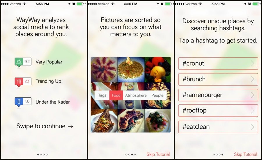
There are a lot of apps out there but WayWay intrigued me early on. It’s clever, concise but also has a spark of flair not to mention surprisingly accurate results. Below are a few slides from their intro presentation for new users. In a broad sense, WayWay uses elements of FourSquare, Instagram and FoodSpotting to help users discover trendy hotspots in their local area.
How to use WayWay: Keywords, Hashtags and Photos
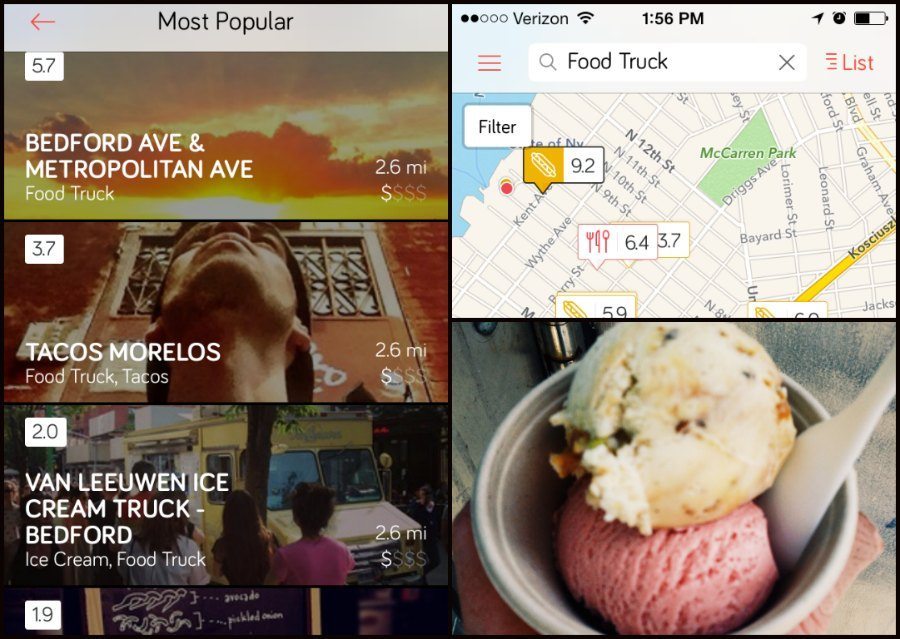
Despite the simple interface (and I mean this in the best way because some apps are so over-the-top that they just confuse me), there are several ways to uncover local gems. The main screen is simply a map of the area and similar to Google Maps, you can easily toggle between neighborhoods. The default is your current location but if you want to pick a restaurant, for example, just use your finger to drag the screen to a different area or to zoom in or out.
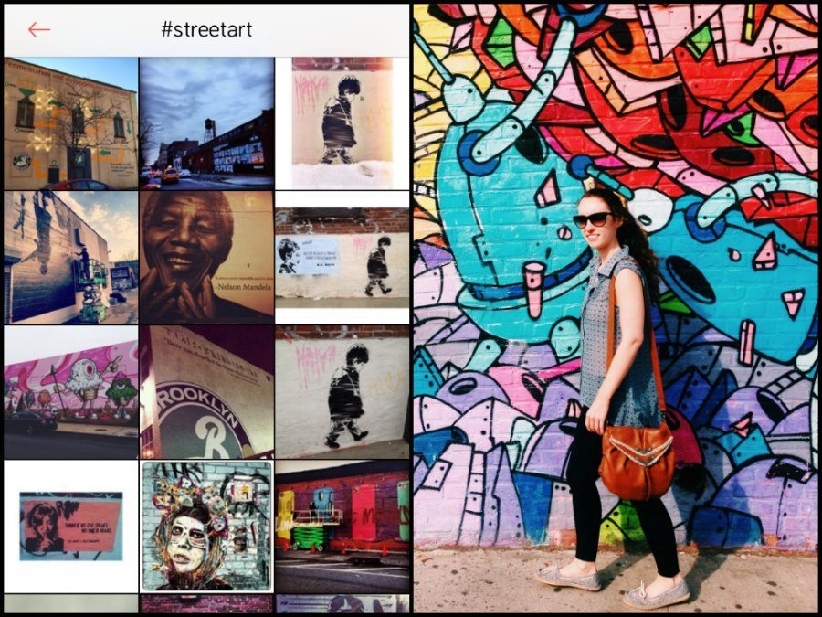
Before hitting the ground running, I spent a few minutes orienting myself with the interface. I searched for coffee, food and street art a few different ways. First, I simply typed in the term. Then I went to “List” to see everything in a list form rather than color coded on the map. Speaking of colors, green = very popular, red = trending and blue = under the radar and based on my findings, they were pretty accurate, at least for Williamsburg. There’s also a rating system and an option to find more information.
If you’re more of a visual person, I’d recommend searching by images rather than terms. One really interesting feature is the ability to toggle among photos organized into four categories: Tags, Food, Atmosphere and People. So if you’re more concerned with the ambiance of a space, definitely hit the Atmosphere button and if you’re looking for a social place to hang out, People is your best bet. Again, the photos were quite accurate based on the category you chose to view.
If you’re really into the social component of WayWay, there are more than enough elements to keep you entertained but if you’re just looking for a good place to grab some grub, the map feature is really all you need. Once you pick a spot, click for more info and you’ll see the address, website, link to the venue’s social media channels and a telephone contact number. WayWay strikes a good balance between serving as a discovery app and a social platform. You can be as social within the community as you want but there’s no pressure to contribute reviews if you’re solely interested in finding trendy places to dine.
Overall Impressions:
I plan to continuing to use WayWay for a few reasons. Firstly, I like having a few types of search options. If I want to go to the trendiest place of the moment, I just have to look at the color coded map. If I’m looking for food or art inspiration, I’d search for a general hashtag and then sift through the most recent photos. I’d probably make my decision on where to eat, etc. based upon the photos rather than on user reviews but that’s just my personal preference.
Downsides?
All in all, I find this app super useful as both a traveler and a travel writer. The only downside was that it crashed once on me and that some of the hashtag photo galleries take awhile to load. Other than that, there’s nothing I particularly didn’t like about WayWay.
Best feature?
In my opinion, the best feature hands down is the little WayWay swivel that it does when searching for the results. It’s hard to explain so you’ll just have to trust me on this one but it’s a much better alternative to the color wheel or the hourglass.
Like me on Facebook and Tweet me: @BohemianTrails.
Sign up for my free monthly BOHO BLAST!
