Our Artist of the Week is Toni Silber-Delerive who has been doing art virtually all of her life. Born in Philadelphia, she received her B.F.A. in Painting from the Philadelphia College of Art and studied at the School of Visual Arts. A Manhattan-based artist and graphic designer, Toni’s work is featured in private and corporate collections and has been in many exhibitions.

MM: How/when did you begin painting?
TS: I always knew that I wanted to be an artist. Art is a passion I was lucky enough to be born with. In high school, Art was my major and then I attended Philadelphia College of Art were I majored in painting. When I had to make a career choice, I opted for graphic design, eventually forming my own marketing communications firm, ToniDesign.
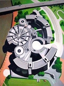

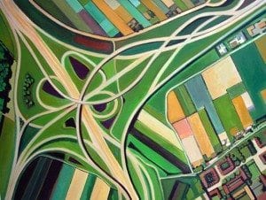
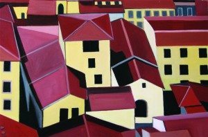
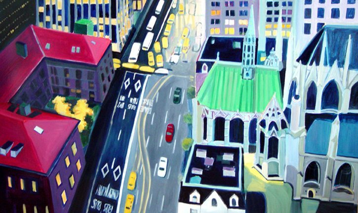
The thread running through my aerialscapes is our variegated planet seen from the air. Whether on board a helicopter or standing at the top of a building, I’m always searching for images that reflect the world around me and have the potential to tell a story about their location or their relationship between man-made and natural, agrarian and industrial, labor and leisure. Some of the locations are specific like the government building in Dusseldorf, Germany or convey the feeling of an urban community, like Manhattan rooftops. While much of my inspiration comes from specific locations, many are not well known but rather I want to leave room for the viewer’s imagination, thus allowing the painting to speak to each individual in a different way.
MM: Have you been to each city/location that you depict in your paintings?
TS: Many of the locations that I depict are the fruit of actual visits, like Sao Paulo, Brazil; Quebec City; Stare Mesto, Prague; Jamaica; Salzburg, Austria; Lyon, France; Quebec City, Chiloe Island, Chile and most of the US locations. Because of the bird’s eye view I depict however, other visual sources help me to capture the location.
MM: Can you explain your use of color and geometry and what it brings to your paintings? 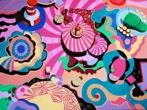

By flattening the picture plane the aerial perspective reduces the details to a strong graphic image. It combines elements of abstraction and representation, pattern and grid, surface and illusion, as well as observation, imagination, and memory, ingredients I’m always looking for. The subject is often and appropriately a place devoid of people viewed from on high. “Carnival” and “Dusseldorf” are both characterized by circularity and the energy that comes from this like the movement of gear cogs. The fact that “Carnival” is festive and “Dusseldorf” sober and purposeful speaks to the essential unity of my vision expressed in the widest range of subjects.
MM: How has your background in graphic design contributed to your craft?
TS: In my career as a designer I have to solve the client’s problem. As an artist I create my own vision, seeing the world from a different perspective. By flattening the picture plane I reduce the details to strong graphic images. It is this interplay of shapes, color, pattern and grid, which communicates the message in my painting as it does in my graphic design solutions. Which you can see in my official gallery.

TS: Creating art is one thing but if you want to exhibit and sell your work there are no set rules or guidelines available, publications by career coaches and publishers like ArtNetwork might help. There are also many websites that offer listings of opportunities for artists to exhibit work. Having gallery representation is of course best, but this is the hard part.
-Megan

Like Bohemian Trails on Facebook and Tweet me at @BohemianTrails


